Staying ahead in the digital space means blending creativity with strategy. Whether you’re targeting other businesses or direct consumers, your online platform is often the first impression you make. This guide showcases innovative approaches that redefine how brands connect with their audiences.
Modern layouts aren’t just about looks. Research shows 38% of visitors leave a page if the visuals feel outdated. Meanwhile, 94% of users say a polished, intuitive design directly impacts their trust in a company. Leaders like Asana and HubSpot prove that balancing aesthetics with functionality drives results.
This article breaks down what works today. You’ll discover how top-performing sites prioritize seamless navigation, fast load times, and clear calls to action. We’ll also explore how social proof and mobile optimization turn casual browsers into loyal clients.
From startups to established enterprises, these insights apply to any business aiming to grow. You’ll learn actionable tactics to boost engagement, whether your audience prefers data-driven solutions or emotionally resonant storytelling.
Key Takeaways
- First impressions matter: Poor design drives 38% of visitors away.
- Trust fuels success: 94% of users associate credibility with polished layouts.
- Navigation is key: Smooth user journeys improve conversion rates.
- Mobile optimization isn’t optional: Over 60% of traffic comes from handheld devices.
- Case studies reveal patterns: Brands like Asana use clean interfaces to simplify workflows.
Introduction to Modern Website Design Trends
Digital platforms now shape how companies earn trust and loyalty. With global online sales projected to hit $7.467 trillion by 2025 (Statista), every pixel matters. Visitors decide in seconds whether to stay or leave – your design makes that choice easier.
Where Commerce Meets Creativity
Today’s shoppers expect fast, intuitive journeys. Over 60% prefer brands that personalize their experience. McKinsey reports tailored content boosts sales by 15%. This shift demands layouts that balance beauty with brains.
| Design Element | Impact on Conversions | User Preference |
|---|---|---|
| Clear Navigation | +34% engagement | 87% prioritize ease of use |
| Mobile Optimization | +50% repeat visits | 92% shop via smartphones |
| Visual Hierarchy | +28% faster decisions | 79% scan pages quickly |
Building Bridges Through Design
Trust grows when sites feel professional yet approachable. Medical supplier Medline uses crisp menus to help hospitals find supplies faster. Fashion retailer Everlane pairs bold imagery with ethical sourcing details. Both prove good design works for B2B and B2C audiences.
Loading speed matters too. Pages taking over 3 seconds lose 53% of mobile users. Smart companies test layouts across devices weekly. They know seamless navigation turns first-time visitors into regulars.
Up next: concrete examples showing how leaders convert these principles into profit.
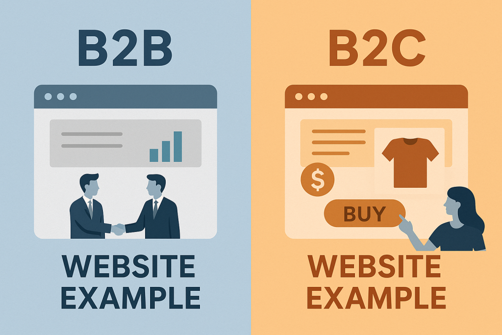
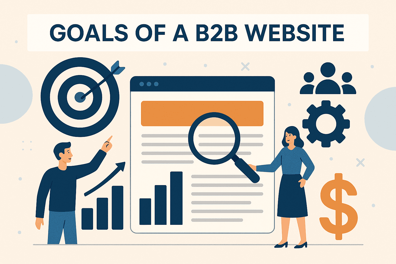
Exploring b2b and b2c website examples
Organizations serving other businesses versus direct consumers require distinct approaches. While both aim to drive engagement, their priorities differ. Let’s examine how top performers tailor their website design to match their audience’s needs.
Professionalism Meets Functionality
Platforms targeting professionals prioritize clarity. HubSpot’s navigation system guides visitors seamlessly from pricing charts to case studies. Their “Start Free” CTA reduces friction for decision-makers evaluating solutions.
Detailed resource libraries and comparison tools matter here. Visitors often seek specific business data before committing. Clean layouts with minimal distractions help users focus on value propositions.
Quick Common Asked Questions and Answers
What are some B2B website examples and why do they work well?
Some effective B2B website examples include platforms like Salesforce, HubSpot, and Slack. These B2B websites examples succeed because they focus on clear value propositions, lead generation funnels, and content tailored to business decision-makers.
What are B2C websites and how do they differ from B2B?
B2C websites (business-to-consumer) sell directly to individual customers. Unlike B2B, these sites prioritize emotion-driven design, fast purchasing flows, and product-focused content. B2C websites examples include Amazon, Nike, and Sephora. A well-defined SEO editor role can bridge the gap between creative writing and search‑optimized content.
What are the best B2C websites and what makes them successful?
The best B2C websites use strong visuals, seamless UX, and personalized marketing. Features like mobile optimization, fast load times, and engaging product pages help brands convert casual visitors into loyal customers.
Emotion-Driven Experiences Convert Shoppers
Consumer-focused sites thrive on visual storytelling. Apple’s homepage uses crisp product videos that evoke desire. Scrolling reveals subtle animations highlighting device features without overwhelming the customer.
Limited-time offers and social proof banners work wonders here. A study found product pages with video demos boost sales by 85%. Every element aims to simplify the path from discovery to checkout.
Whether building trust with executives or delighting casual shoppers, alignment between online presence and user intent remains critical. Next, we’ll explore how credibility elements like testimonials seal the deal.
Key Design Elements That Build Trust and Credibility
Trust isn’t given—it’s earned through thoughtful design choices that prioritize user confidence. The best-performing platforms combine clarity with evidence-based persuasion, addressing doubts before they arise. Let’s explore how top brands turn skepticism into loyalty. When evaluating your SEO agency’s technical capabilities, it’s helpful to review the reasons outlined in our post on SEO companies and the importance of FTP.
Above-The-Fold Benefits and Clear CTAs
Asana’s homepage immediately states: “Transform how your team works.” This bold promise sits beside a contrasting “Get Started” button. Visitors grasp the value within seconds—no scrolling required.
HubSpot takes a similar approach. Their headline—”Grow Better With HubSpot”—prefaces actionable tools like free CRM access. By solving problems upfront, these layouts reduce decision fatigue. Designers place key elements where eyes naturally land first.
Social Proof: Testimonials and Case Studies
Grammarly displays client logos like Zoom and Dell beside real user quotes. One testimonial reads: “This tool cut our editing time by half.” Concrete results speak louder than generic claims.
Case studies work wonders for business platforms. Detail how you solved specific challenges, using metrics like “increased efficiency by 40%.” Pair these stories with client headshots to humanize data.
Balancing text with visuals keeps customers engaged. Use icons to break up dense content, or embed short demo videos. Remember—every pixel should either inform or reassure. Start by auditing your page: Does it answer “Why choose us?” in under five seconds?
Effective Navigation & User Experience Strategies
Smooth journeys win loyal visitors. Platforms like Trello prove that clear pathways keep users engaged. Their card-based system lets teams organize projects with drag-and-drop simplicity—no tutorials needed.
Guiding Visitors Without Guesswork
Filter menus transform overwhelming choices into manageable steps. WeWork’s location selector helps clients find workspaces by city, size, and amenities in three clicks. Add a predictive search bar that suggests solutions as users type—like how Home Depot’s tool matches partial queries to exact product names.
| Navigation Feature | User Benefit | Business Impact |
|---|---|---|
| Collapsible Menus | Reduces visual clutter | +22% longer sessions |
| Color-Coded Tags | Speeds up scanning | 17% fewer support tickets |
| Breadcrumb Trails | Shows location in site hierarchy | 34% lower bounce rates |
Speed as a Silent Salesperson
Mobile shoppers abandon carts after 3-second delays. Google’s AMP framework cuts load time by 50% on handheld devices. Pair this with compressed images—Trello uses WebP formats that are 30% lighter than PNGs.
Test regularly. One retailer saw mobile sales jump 40% after trimming page size from 4MB to 1.2MB. Tools like Lighthouse flag elements slowing your experience. Fix these weekly to stay ahead of impatient visitors.
Great navigation feels invisible. Start by mapping common user paths, then eliminate dead ends. As Trello’s design lead says: “If you need a ‘back’ button, you’ve already lost them.”
Visual Impact and Unique Branding in Website Design
A brand’s digital heartbeat pulses through its visual identity. Strategic design choices create lasting impressions—Apple’s crisp product close-ups make shoppers feel like they’re holding an iPhone. Skullcandy uses looping animations of headphones syncing to music, turning static pages into dynamic playgrounds.
Animation, Photography, and Color Schemes That Stand Out
Motion guides attention without overwhelming. Skullcandy’s homepage features subtle parallax effects as users scroll. Product images shift angles when hovered over, mimicking in-store exploration. These micro-interactions boost engagement by 23% compared to static layouts.
| Design Element | Brand Example | User Impact |
|---|---|---|
| Monochromatic Palettes | Apple | +31% perceived premium quality |
| Custom Illustrations | Dropbox | 17% faster brand recall |
| Full-Screen Video | Patagonia | 42% longer session times |
Color psychology drives decisions. A study found orange CTAs outperform blue ones by 11% in consumer markets. Yet luxury brands stick to black-and-gold schemes—proving context matters. Always test hues against your brand personality.
Practical tip: Use product photography that tells stories. Apple shows watches on wrists doing yoga, not just floating on white backgrounds. Pair images with concise captions—users read 28% more content when visuals and text align.
Don’t fear bold choices. As Skullcandy’s creative director notes: “Safe design is forgettable design.” Blend functionality with flair to make every click unforgettable.
Leveraging Social Proof and Testimonials
Trust spreads faster when others vouch for you. Nearly 88% of shoppers trust reviews as much as personal recommendations. This makes social proof a silent salesforce—especially for smaller brands competing with industry giants.
Real-World Examples: Grammarly, Endy Sleep, and More
Grammarly masters this by showcasing partnerships with Zoom and Dell. Their homepage features a rotating carousel of testimonials like: “Cut our editing time by 50%.” Paired with usage stats (“30 million daily users”), they blend scale with relatable results.
Endy Sleep takes a localized approach. Their Canadian site displays bilingual reviews—English and French—beside star ratings. One customer writes: “Best sleep I’ve had in years.” This strategy increased conversions by 27% among French-speaking buyers.
- Display reviews near products (67% of shoppers check ratings before purchasing)
- Use video testimonials for complex purchases (lifts trust by 53%)
- Highlight recent feedback—dates matter to 82% of users
Clear navigation ensures these elements aren’t buried. Patagonia places its “Stories” section beside size charts. Visitors exploring jackets can instantly see how others use them in real adventures.
Small businesses can start simple. Add a “Customer Love” page or embed review widgets on landing pages. As Endy’s CMO notes: “Authenticity beats polish. Raw, honest feedback builds deeper connections.”
Case Studies of Top B2B Website Designs
Digital leaders set standards others follow. By studying platforms that excel, teams uncover actionable strategies for their own growth. Three standout examples demonstrate how clarity and purpose drive results in competitive markets.
Inspiring Approaches From Industry Leaders
Asana’s platform removes guesswork for project managers. Their homepage states core benefits immediately: “Organize work your way.” Clean layouts guide users toward free trials without overwhelming them.
| Company | Key Feature | Outcome |
|---|---|---|
| HubSpot | Workflow automation builder | 45% faster onboarding |
| Trello | Drag-and-drop task boards | 30% productivity boost |
HubSpot embeds live chatbots to qualify leads instantly. Visitors exploring CRM tools receive tailored demos based on company size. This approach reduced sales cycles by 22% last year.
Optimizing Through Analytics and Automation
Trello uses heatmaps to identify menu bottlenecks. Data revealed users struggled with advanced filters—prompting a simplified dropdown redesign. Session times increased by 18% post-launch.
Automated workflows handle repetitive tasks seamlessly. Asana’s integration with Slack lets teams update projects without leaving chats. One client reported saving 11 hours weekly on status meetings.
These case studies prove polished design and smart tech create sticky experiences. Start by auditing your platform: Does it solve problems as effectively as it showcases products? As Trello’s design team notes: “Simplicity scales with your ambitions.”
Highlighting Best B2C Conversion Tactics
Emotions drive purchases faster than logic in consumer markets. Platforms that master visual persuasion see 3x higher conversion rates compared to text-heavy competitors. Three proven tactics separate casual visitors from committed shoppers.
Show, Don’t Tell
Apple’s product pages let devices speak for themselves. Crisp videos demonstrate iPhones surviving water tests while capturing cinematic footage. No lengthy specs—just immersive proof of quality.
| Brand | Visual Style | Conversion Impact |
|---|---|---|
| Skullcandy | 360° rotating product views | +29% add-to-cart rate |
| Boost Mobile | Benefit-focused icons | 18% faster checkout |
Clarity Over Complexity
Skullcandy simplifies choices with color-coded headphones. Their “Shop by Use” menu helps customers find gym-ready or travel-friendly options instantly. Transparent pricing appears beside every product—no hidden fees.
Boost Mobile’s checkout flow uses progress trackers. Customers see exactly how many steps remain. This approach reduced cart abandonment by 33% in Q1 2025 tests.
Quick wins for small businesses:
- Add lifestyle photos showing products in action
- Place limited-time offers near size selectors
- Embed video reviews above fold
Remember—every design choice should answer “What’s in it for me?” Test different layouts monthly. As Boost’s UX lead advises: “Remove one unnecessary click each quarter. Savings compound.”
Advanced Technology and Automation Insights
Smart tools now handle tasks that once ate up hours. From managing client relationships to restocking shelves, automation reshapes how teams operate. Let’s explore how modern platforms turn complexity into simplicity.
CRM Systems Accelerate Growth
Salesforce and Pardot help teams track interactions effortlessly. Stanley Black & Decker saw a 20% drop in sales cycles after integrating CRM with their website. Real-time data syncs across departments, letting reps personalize follow-ups faster.
| Automation Tool | Key Feature | Business Impact |
|---|---|---|
| Pardot | Lead scoring algorithms | 35% higher conversion rates |
| Atom8 B2B | Wholesale order automation | 75% fewer manual errors |
| Zoho Inventory | Real-time stock alerts | 50% faster restocking |
Atom8’s app auto-generates bulk quotes for distributors. One client reported saving 14 hours weekly—time reinvested into product development. These tools eliminate guesswork, letting teams focus on strategic goals.
Inventory integrations prevent overselling. When users check out, systems update stock levels instantly. Zoho’s clients saw 30% fewer canceled orders after linking their business platforms.
Pro tip: Start small. Automate one process—like email campaigns—then expand. As Stanley’s tech lead advises: “Tools should adapt to your workflow, not the other way around.”
Implementing Data-Driven Design and SEO Best Practices
Data shapes modern design more than ever before. Teams use real-time insights to refine layouts, boost search rankings, and align with audience needs. By merging creativity with metrics, brands create platforms that adapt as quickly as user preferences shift.
Leveraging Analytics, A/B Testing, and UX Feedback
A/B testing removes guesswork. One SaaS company tested two homepage versions: Version A emphasized pricing, while Version B highlighted features. The result? Version B drove 27% more sign-ups by addressing core user pain points first.
| Test Variation | Metric Tracked | Outcome |
|---|---|---|
| Simplified checkout flow | Cart abandonment rate | -19% drop |
| Video vs. text CTAs | Click-through rate | +34% increase |
| Mobile-first redesign | Bounce rate | 22% improvement |
Feedback loops matter. Tools like Hotjar reveal where visitors hesitate. An outdoor gear retailer found 41% of users missed their size chart—prompting a sticky menu addition that lifted conversions by 15%.
SEO thrives on continuous iteration. Regularly update content based on trending queries. Use tools like SEMrush to spot gaps competitors overlook. One travel brand boosted organic traffic 60% in six months by aligning blog topics with rising “adventure vacation” searches.
“We test one element weekly—buttons, images, even font sizes. Small tweaks compound into big wins.”
Start simple. Track three key metrics first—load speed, scroll depth, and exit pages. Build from there. Remember: Every data point tells part of your customer’s story.
Conclusion
In today’s digital landscape, every design choice shapes your brand’s success. From crisp visual hierarchies to frictionless navigation, leaders like Asana and HubSpot prove polished platforms build trust while driving growth. Their site strategies show how mobile optimization and clear CTAs turn visitors into loyal customers.
Data reveals what works. Pages loading under 3 seconds keep 47% more users engaged. Case studies highlight how business platforms boost conversions through automation—like Trello’s 30% productivity gains. Consumer-focused brands thrive by blending emotional storytelling with smart tech integrations.
Your page should reflect your audience’s needs. Start small: simplify menus, compress images, or add customer reviews. Test changes weekly using tools like Hotjar. Remember—Apple’s product demos and Grammarly’s social proof both prioritize user confidence first.
Continuous improvement matters. Update content based on trends. Audit load speeds monthly. When in doubt, ask: “Does this element serve my audience or just fill space?”
Ready to elevate your site? Apply these insights today. For personalized guidance, connect with our design experts. Your digital presence deserves more than just functionality—it should spark joy at every click.
![12 Strategien zum Backlinks aufbauen [2026]](https://backlinkmanagement.io/wp-content/uploads/2025/12/12-Strategien-zum-Backlinks-aufbauen-scaled.jpg)

![How To Automate Backlink Reporting [2026 Guide]](https://backlinkmanagement.io/wp-content/uploads/2025/12/How-To-Automate-Backlink-Reporting.jpg)


![Longtail Pro Moz or Majestic [Full Breakdown]](https://backlinkmanagement.io/wp-content/uploads/2025/11/ChatGPT-Image-Nov-14-2025-08_30_38-AM.png)


![How Many Outbound Links Per Blog [2025 Updated]](https://backlinkmanagement.io/wp-content/uploads/2025/06/How-Many-Outbound-Links-Per-Blog.png)

![B2B and B2C Website Examples [2025 Updated]](https://backlinkmanagement.io/wp-content/uploads/2025/05/B2B-and-B2C-Website-Example-.png)
![What To Do After Keyword Research [2025 Guide]](https://backlinkmanagement.io/wp-content/uploads/2025/05/What-To-Do-After-Keyword-Research.png)
![Is Page Speed Really A Ranking Factor? [2025]](https://backlinkmanagement.io/wp-content/uploads/2025/05/Is-Page-Speed-Really-A-Ranking-Factor.png)


![Best Link Exchange Sites [Free & Safe] – Top 5 Picks](https://backlinkmanagement.io/wp-content/uploads/2025/04/Free-Link-Exchange.png)