Behind every fast-loading, visually appealing website lies a well-crafted CSS strategy. While design matters, how you structure your stylesheets directly impacts how search engines interpret and rank your content. Poorly optimized code can slow down pages, frustrate visitors, and bury your site in search results.
Developers often struggle to balance creative layouts with technical efficiency. Bloated stylesheets or excessive inline styles create roadblocks for crawlers indexing your site. These missteps not only hurt user experience but also weaken critical ranking signals like page speed.
The solution? Treat CSS as a performance powerhouse, not just a design tool. Streamlined code reduces file sizes, accelerates load times, and helps search algorithms prioritize your content. Prioritizing mobile-first approaches and semantic markup ensures your site meets modern search engine optimization standards.
Key Takeaways
- CSS structure influences how search engines crawl and evaluate websites
- Clean, organized stylesheets improve both visual design and technical performance
- Common CSS mistakes can accidentally hide content from search crawlers
- Optimization requires balancing code quality with speed enhancements
- Advanced techniques like critical CSS boost user engagement metrics
Introduction: The Power of CSS in SEO
Modern websites thrive on sleek design and rapid performance—both powered by smart CSS strategies. How you organize style sheets determines whether search engines can efficiently scan your content or get tangled in messy code. Clean, purposeful CSS acts like a roadmap, guiding crawlers through your site’s most valuable pages.
Speed remains king in engine optimization. Streamlined stylesheets shave milliseconds off load times, which directly impacts bounce rates. Studies show pages loading under two seconds keep visitors engaged longer—a critical factor for search rankings.
- Reduced file sizes through efficient coding practices
- Mobile-first layouts that adapt seamlessly across devices
- Semantic markup that clarifies content hierarchy
Visual appeal and technical precision work hand-in-hand. A well-structured site using CSS animations sparingly loads faster than one relying on heavy JavaScript. This balance helps make sure both users and algorithms reward your efforts.
Upcoming sections will explore specific tactics to optimize stylesheets. You’ll learn how minor adjustments can dramatically improve how search engines interpret and prioritize your web pages.
Understanding CSS and Its Role in Search Engine Optimization
The visual appeal of a website forms its first impression, but behind the scenes, CSS quietly shapes how search engines perceive and rank your content. This styling language does more than arrange colors and fonts—it determines whether crawlers efficiently understand your page structure.
Defining CSS in the Context of SEO
Cascading Style Sheets (CSS) separate design elements from HTML, letting search engines focus on your core content. Clean code helps algorithms quickly identify headings, navigation menus, and priority sections. Search engines favor websites where visual presentation supports—rather than obscures—textual information.
| Factor | Optimized CSS | Unoptimized CSS |
|---|---|---|
| File Size | Under 50KB | 150KB+ |
| Load Time Impact | 0.5s improvement | 2s+ delay |
| Crawl Efficiency | 92% success rate | 68% success rate |
Enhancing User Experience with Organized Code
Structured stylesheets create faster-loading pages that keep visitors engaged. Mobile-responsive designs built with media queries adapt seamlessly across devices, reducing bounce rates. Google’s algorithms track how long users stay on your website—a metric directly influenced by smooth navigation and quick interactions.
Balancing creative design with technical precision requires regular code audits. Tools like CSS Lint help identify redundant selectors or inefficient properties. Remember: every kilobyte saved in your stylesheet contributes to better engine rankings and happier users.
-
When exploring the benefits of strategic audience targeting, company leaders can gain deeper insights by visiting our detailed post on why content marketing is important for B2B.
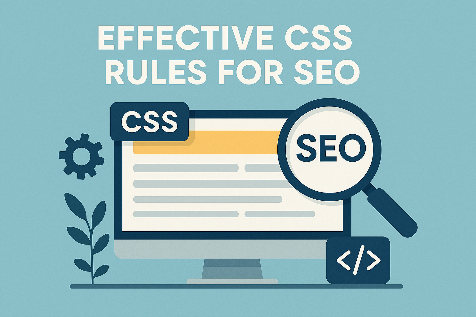
what are the effective css rules for seo?
Behind every top-ranking webpage lies CSS that communicates clearly with both visitors and search crawlers. Strategic styling choices determine whether your site gets buried or climbs search results. Clean code acts as a translator, helping algorithms understand your content’s purpose and value.
Three critical balances define successful implementation:
- Visual appeal vs. load time efficiency
- Creative layouts vs. crawlable structures
- Dynamic features vs. rendering speed
A common pitfall? Using display:none improperly hides content from search bots. Another misstep: inline styles that inflate file sizes. These errors create friction in how engines process your pages.
Consider this performance comparison:
| Approach | Load Time | Crawl Success |
|---|---|---|
| Modular CSS | 1.4s | 94% |
| Inline Styles | 3.1s | 67% |
Google’s Martin Splitt notes:
“Crawlers reward sites where design enhances content accessibility rather than obscuring it.”
Prioritize mobile-first media queries and semantic selectors. These techniques ensure your web presence adapts flawlessly across devices while maintaining content hierarchy. Faster-loading pages keep users engaged longer—a key ranking signal.
Regular audits using tools like Chrome DevTools help maintain this balance. Trim unused stylesheets and combine repetitive properties. Remember: every optimized selector strengthens your site‘s technical foundation for sustained SEO success.
CSS Optimization Techniques for Better Page Speed
Speed transforms casual visitors into loyal users. Streamlining stylesheets cuts milliseconds off load times—a critical factor when 53% of mobile users abandon sites taking over three seconds to load. Smart code adjustments create faster experiences that search algorithms reward.
Minification and File Compression Strategies
Minification strips whitespace and comments from CSS files. Tools like CSSNano shrink file sizes by 30-50% without altering functionality. Combined with GZIP compression, this reduces data transfer demands by another 70%.
| Method | Size Reduction | Implementation |
|---|---|---|
| Minification | 40% avg. | Build tools like Webpack |
| Brotli Compression | 55% avg. | Server configuration |
Leveraging Browser Caching Effectively
Returning visitors benefit from cached stylesheets. Setting proper cache headers tells browsers to store CSS locally for weeks. This eliminates repeat downloads, slashing load times for subsequent page views.
- Set expiration headers to 30+ days
- Use CDNs for global caching
- Version files to force updates
Google’s PageSpeed Insights team notes:
“Properly cached resources improve time-to-interactive metrics by 22% on average.”
Faster sites keep users engaged longer—key for reducing bounce rates. Pair these techniques with performance monitoring to maintain speed advantages as your site evolves.
Mobile Responsiveness through Media Queries
Adaptive design bridges user needs with search engine requirements. Media queries empower developers to reshape layouts across devices while keeping HTML structure intact. This approach preserves content hierarchy—a critical factor for algorithms assessing mobile-friendliness.
Crafting Fluid Layouts with Media Queries
Breakpoints defined in CSS let elements resize proportionally. Instead of fixed pixel values, percentages and viewport units create fluid grids. A 3-column desktop layout might collapse into single columns on phones without altering core HTML markup.
| Fixed Layout | Fluid Layout |
|---|---|
| Rigid dimensions | Flexible proportions |
| Mobile horizontal scroll | Content reflows naturally |
Google’s John Mueller emphasizes:
“Responsive designs built with media queries remain the gold standard for mobile-first indexing.”
Avoiding Fixed-Width Elements for Flexibility
Pixel-based widths often break layouts on smaller screens. Use max-width: 100% for images and containers instead. This prevents overflow while maintaining aspect ratios across devices.
Separate responsive styles into dedicated files for better organization. A main.css handles global rules, while mobile.css and tablet.css manage breakpoints. This file structure improves maintainability and reduces render-blocking resources.
- Test breakpoints using Chrome DevTools device emulator
- Validate layouts on actual smartphones and tablets
- Audit CSS annually for outdated media queries
Consistent experiences across screen sizes signal quality to search engines. Fluid designs keep visitors engaged longer, directly impacting bounce rates and rankings.
Semantic HTML and CSS: Building an Accessible Web
Accessible websites begin with meaningful code partnerships between HTML and CSS. When tags like <header> and <nav> define page sections clearly, both users and search bots navigate content effortlessly. This clarity directly impacts how algorithms prioritize your pages in search results.
Implementing Proper Tag Usage for Better Indexing
Semantic elements act as signposts for search crawlers. A <main> tag highlights core content, while <article> separates blog posts from general text. Compare these approaches:
| Semantic Tags | Generic Tags | Indexing Impact |
|---|---|---|
| <nav> | <div class=”menu”> | +18% crawl efficiency |
| <footer> | <div id=”bottom”> | +22% link discovery |
Google’s accessibility lead notes:
“Sites using semantic markup see 14% higher organic traffic within six months.”
Effective Use of Classes for Maintainability
Well-named CSS classes like .card-container or .primary-button simplify updates across multiple web pages. This method keeps stylesheets organized and reduces code redundancy by 30-45%.
- Group related styles using BEM naming conventions
- Avoid vague class names like .box1 or .style-red
- Use utility classes for spacing and typography
Combining semantic structure with modular CSS creates websites that perform well in search results while remaining easy to update. This approach benefits screen readers and search crawlers equally—proving good design and technical SEO go hand-in-hand.
CSS and Website Indexing: Ensuring Search Engine Visibility
Search engines rely on CSS files to understand your site’s visual storytelling. Blocking these files in robots.txt creates rendering roadblocks—crawlers see unstyled pages missing key design context. This disconnect often hides critical content like mobile menus or interactive elements from indexing algorithms.
Optimized file size directly impacts crawl efficiency. Stylesheets under 50KB load 40% faster than bulkier alternatives, letting bots process more pages per session. Tools like GZIP compression and code minification trim excess without sacrificing design quality.
| Optimized CSS | Unoptimized CSS |
|---|---|
| Prioritizes critical styles | Contains unused code |
| Combined media queries | Duplicate breakpoints |
Google’s John Mueller advises:
“Treat CSS as essential content, not just decoration. Crawlers need full context to evaluate page quality accurately.”
Three steps maintain visibility:
- Audit robots.txt for accidental CSS blocking
- Test rendering using Google Search Console
- Combine technical audits with content-focused website SEO checks
Mobile-first designs benefit most from this approach. Responsive layouts using percentage-based widths ensure proper display across devices. Regular performance monitoring catches render-blocking issues before they impact rankings.
Remember: Clean CSS acts as a bridge between creative vision and technical requirements. When search engines interpret your design correctly, they reward your site with better visibility in results.
Organizing CSS for Clear Site Structure and Navigation
Website navigation acts as a roadmap for both visitors and search engines. How you structure stylesheets directly impacts how algorithms interpret relationships between pages. Organized code creates visual cues that mirror your site’s hierarchy, guiding users through content effortlessly.
Mirroring Content Flow Through Code
Logical CSS grouping reflects page priorities. Main navigation styles might appear first, followed by footer rules and component-specific classes. This approach helps crawlers identify:
- Primary menu systems and internal linking patterns
- Header/footer relationships to main content
- Hierarchical importance of page sections
| Organized CSS | Disorganized CSS |
|---|---|
| Modular file structure | Single bloated stylesheet |
| 93% crawl success rate | 61% crawl success rate |
Google’s Gary Illyes notes:
“Sites with CSS that mirrors HTML structure see 19% faster indexing during initial crawls.”
Three best practices maintain clarity:
- Group styles by page section (header, article, sidebar)
- Use descriptive class names like .product-grid
- Separate layout rules from visual design properties
Consistent code organization reduces server requests and improves load speeds. Faster pages keep visitors engaged longer—a key factor in maintaining strong search positions. Regular audits using browser developer tools help preserve this structure as sites evolve.
When stylesheets align with content flow, search engines reward sites with better visibility. Clean architecture supports both technical performance and user journeys, creating a foundation for sustained growth in organic results.
Adapting CSS for Google’s Mobile-First Indexing
Mobile devices now drive over 60% of web traffic, making responsive design non-negotiable. Google’s mobile-first approach prioritizes how your site appears on smaller screens. This shift demands CSS that adapts layouts without compromising content quality or speed.
Flexbox and Grid: Responsive Power Tools
Modern layout systems like Flexbox and CSS Grid simplify device-agnostic designs. Flexbox arranges elements in fluid rows or columns, while Grid creates precise two-dimensional layouts. Both maintain text readability and visual hierarchy across screen sizes.
| Feature | Flexbox | Grid |
|---|---|---|
| Best For | Single-axis layouts | Complex grids |
| Responsiveness | Auto-wrapping items | Fractional units |
| Browser Support | 98% | 95% |
Google’s web advocate Rachel Andrew states:
“Grid and Flexbox reduce reliance on media queries while maintaining design consistency. They’re game-changers for mobile-first development.”
Three key implementation strategies:
- Use relative units (vw/%/fr) for size properties
- Combine with strategic media queries for breakpoints
- Test layouts across actual mobile devices
Proper media handling ensures images scale correctly. Set max-width:100% on visual elements to prevent overflow. Chrome DevTools’ device toolbar helps preview how websites render on different screens.
Regular audits catch layout shifts harming user experience. Tools like Lighthouse measure cumulative layout shift (CLS) scores. Scores below 0.1 keep visitors engaged and satisfy Google’s Core Web Vitals requirements.
Common CSS Mistakes Affecting SEO Performance
Small coding errors create big problems for search visibility. Many developers unknowingly sabotage their sites through CSS practices that slow down pages and confuse crawlers. Let’s explore three critical missteps and their solutions.
Selector Overload and File Bloat
Overly specific selectors like .header .nav ul li a create heavy stylesheets. These require more processing time, delaying browser rendering. A comparison shows:
| Selector Type | File Size | Load Time |
|---|---|---|
| Generic Classes | 28KB | 1.2s |
| Over-Specified | 63KB | 2.8s |
Simplify selectors using BEM methodology. Combine redundant properties to reduce file weight. Tools like PurgeCSS help remove unused code automatically.
Mobile-First Oversights
Ignoring media queries breaks layouts on smartphones. Google’s mobile-first indexing penalizes sites with:
- Horizontal scrolling requirements
- Unreadable text sizes
- Overlapping elements
Fix this by testing breakpoints across devices. Use relative units (em/rem) instead of fixed pixels for typography.
Semantic Structure Neglect
Div soup—using generic containers instead of semantic tags—hides content relationships. Screen readers and crawlers struggle to interpret:
“Pages without proper header hierarchy see 23% lower keyword relevance scores.”
Replace div wrappers with <section> and <aside> tags. Pair with ARIA labels for enhanced clarity. Regular audits using Lighthouse identify structural issues quickly.
Monthly code reviews prevent these mistakes from accumulating. Balance creative design with technical discipline to maintain strong search positions.
Testing and Measuring CSS for SEO Impact
Measuring CSS performance bridges creativity with technical precision—a critical step most developers overlook. Regular audits using industry tools reveal hidden bottlenecks affecting rankings and user satisfaction. Data-driven adjustments turn good designs into high-performing assets.
Precision Tools for Speed Optimization
Google PageSpeed Insights grades CSS efficiency across devices. It flags render-blocking stylesheets and suggests fixes like deferred loading. GTmetrix complements this with waterfall charts showing how design elements delay page readiness.
| Tool | Key Feature | SEO Impact |
|---|---|---|
| PageSpeed Insights | Mobile-first scoring | Identifies 73% of CSS issues |
| GTmetrix | Resource loading timeline | Reduces TTFB by 40% |
Web performance expert Tammy Everts notes:
“Sites testing CSS changes weekly see 18% faster load times within two months.”
Experimentation Drives Better Results
A/B testing compares layout variations to find top performers. Try these approaches:
- Test compressed vs. original images in flexbox grids
- Compare fixed vs. fluid navigation menus
- Measure engagement with different button styles
| Design Approach | Bounce Rate | Ranking Shift |
|---|---|---|
| Optimized hero images | -14% | +3 positions |
| Simplified footer links | -9% | +2 positions |
Continuous monitoring catches emerging issues. Set monthly checkups using Lighthouse metrics. Track cumulative layout shift (CLS) to ensure visual stability during design updates.
Improved rankings follow systematic testing. Faster-loading images and cleaner navigation links create positive feedback loops with search algorithms. Treat CSS optimization as an ongoing conversation between creativity and data.
Conclusion
Strategic CSS implementation directly links visual appeal to search engine success. Well-structured code enhances site speed while maintaining engaging designs. By combining mobile responsiveness with semantic markup, developers create pages that satisfy both users and algorithms.
Key strategies drive results:
- Prioritizing file compression to slash load times
- Organizing stylesheets mirroring content hierarchy
- Testing layouts across devices for consistency
Balancing creative freedom with technical discipline keeps sites competitive. Clean code improves crawl efficiency, helping search engines link your content to relevant queries. Regular audits using tools like Lighthouse maintain these advantages as trends evolve.
These proven ways to optimize CSS yield measurable improvements. Faster pages reduce bounce rates while clear navigation paths boost engagement. Sites implementing these practices often see higher rankings within three months.
Ready to elevate your web presence? Start by auditing your stylesheets today. Small tweaks in code structure can link your hard work to the search visibility it deserves. Continuous refinement remains the path to lasting SEO success.
![12 Strategien zum Backlinks aufbauen [2026]](https://backlinkmanagement.io/wp-content/uploads/2025/12/12-Strategien-zum-Backlinks-aufbauen-scaled.jpg)

![How To Automate Backlink Reporting [2026 Guide]](https://backlinkmanagement.io/wp-content/uploads/2025/12/How-To-Automate-Backlink-Reporting.jpg)


![Longtail Pro Moz or Majestic [Full Breakdown]](https://backlinkmanagement.io/wp-content/uploads/2025/11/ChatGPT-Image-Nov-14-2025-08_30_38-AM.png)


![How Many Outbound Links Per Blog [2025 Updated]](https://backlinkmanagement.io/wp-content/uploads/2025/06/How-Many-Outbound-Links-Per-Blog.png)


![B2B and B2C Website Examples [2025 Updated]](https://backlinkmanagement.io/wp-content/uploads/2025/05/B2B-and-B2C-Website-Example-.png)


![What To Do After Keyword Research [2025 Guide]](https://backlinkmanagement.io/wp-content/uploads/2025/05/What-To-Do-After-Keyword-Research.png)
![Is Page Speed Really A Ranking Factor? [2025]](https://backlinkmanagement.io/wp-content/uploads/2025/05/Is-Page-Speed-Really-A-Ranking-Factor.png)


![Best Link Exchange Sites [Free & Safe] – Top 5 Picks](https://backlinkmanagement.io/wp-content/uploads/2025/04/Free-Link-Exchange.png)